Timeless style comes from decisions that age well: balanced proportions, durable materials, a cohesive color story, and layered comfort. Classic design isn’t about freezing your home in one era—it’s about building a calm, reliable foundation and then adding personality in ways that can evolve. The result feels collected, functional, and comfortable in a compact apartment, an open-plan home, or a single-room refresh.
Spaces that last prioritize proportion, function, and comfort over novelty. “Classic” isn’t one strict look; it’s a set of choices that stay appealing across decades—restrained patterns, quality finishes, thoughtful lighting, and repeatable shapes (like arches, clean-lined casegoods, and tailored upholstery). Start with a calm baseline, then let personality show up in art, books, and swap-friendly accents that don’t require a full redesign.
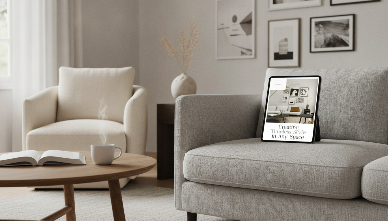
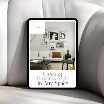
For ongoing ideas and a step-by-step approach, the Creating Timeless Style in Any Space – eBook Guide to Classic Home Design is an easy reference when you want a cohesive plan rather than one-off fixes.
Before choosing finishes, map the room’s purpose: traffic flow, seating needs, storage, and sightlines (what you see first when you enter). A timeless room usually feels “easy” to move through and easy to use—no obstacle course around undersized pieces or awkward furniture angles.
Scale is where many rooms go off track. Anchor the space with a properly sized rug, substantial lighting, and furniture that has enough visual weight to look intentional. Then choose one primary focal point per room—a fireplace, a headboard wall, statement art, or a view—and keep surrounding elements quieter so the focus reads clearly.
| Element | Timeless target | Common pitfall to avoid |
|---|---|---|
| Rug | Large enough for front legs of major furniture to sit on it | Tiny rug that “floats” in the center |
| Coffee table | About 2/3 the sofa length; comfortable reach from seating | Oversized table that blocks circulation |
| Art above sofa/bed | Visually fills the wall without touching edges; centered to furniture | Too small art hung too high |
| Lighting | Layered: ambient + task + accent | Single overhead light doing all the work |
To create continuity, repeat shapes and finishes across the room—warm metal in lighting and hardware, or curved edges echoed in a mirror and side table. That repetition reads “intentional” even when your pieces come from different sources.
Classic color starts with a neutral backbone: warm whites, soft grays, greige, muted taupes, and natural wood tones. The key is undertone consistency. Pick one or two undertones (warm, cool, or balanced) and carry them through the home so adjoining rooms feel connected instead of patched together.
For depth, lean on tone-on-tone layering—multiple values of the same color—rather than high-contrast trend palettes. Save bold color for accents that are easy to update: pillows, throws, small décor, and art. If you want a high-impact change without committing to a whole room overhaul, a controlled accent wall can add definition; the Accent Wall Magic Checklist helps keep the choice clean and classic rather than overly themed.
Materials do much of the heavy lifting in timeless rooms. Natural (or natural-looking) surfaces—wood, stone, linen, cotton, wool, leather, and quality ceramics—develop character instead of looking dated. Patterns work best when they’re restrained: stripes, checks, subtle geometrics, and small-scale botanicals tend to outlast loud, oversized prints.
Mix metals with intention by selecting a dominant finish (like aged brass) and a supporting finish (like matte black) for contrast. Avoid “matchy sets” across furniture and décor; coordinate by repeating color, texture, and silhouette instead. A collected mix looks classic because it feels earned over time.
For professional standards and planning guidance, resources like the American Society of Interior Designers (ASID) and the National Kitchen & Bath Association (NKBA) offer helpful frameworks for durable, functional choices.
Invest in a comfortable sofa in a neutral, durable fabric and pair it with a rug that properly anchors the seating. Add character through layered pillows, books, and art—elements that can shift seasonally without changing the room’s “bones.”
Lean on clean hardware, simple backsplash choices, and warm lighting. Keep countertop décor minimal and functional: a tray, a crock for utensils, or a bowl for fruit. For deeper inspiration across eras and styles, Architectural Digest’s design coverage is a strong reference point for what truly lasts.
Use fewer, better pieces. Prioritize vertical storage, keep color transitions gentle, and choose multi-purpose furniture that doesn’t look “temporary.” If pets are part of daily life, protect the timeless look with practical habits—like wipeable textiles and scratch-smart materials—using Pet-Proof & Pretty: The Home Décor Checklist.
Keep large items neutral and classic, then add personality with art, texture, layered lighting, and a few distinctive pieces (vintage, handmade, or sculptural). Save bold color and strong patterns for accents you can swap easily.
Soft whites, warm off-whites, gentle greiges, and muted taupes are reliable choices. Match undertones to fixed elements like flooring and countertops, and keep the same undertone family across adjoining rooms.
Yes—mixing styles often creates a collected feel. Keep it cohesive by repeating materials and finishes, sticking to consistent undertones, and choosing simple silhouettes for your biggest furniture pieces.

Leave a comment