A statement wall can shift the entire mood of a space—without remodeling the whole room. From paint and wallpaper to paneling, tile, and gallery moments, the key is choosing the right wall, the right scale, and the right finish for the way the room is used. Use the ideas and checklist below to plan a statement wall that looks intentional, photographs well, and holds up to daily life.
A statement wall creates a clear focal point through contrast—color, pattern, texture, sheen, or dimension. The best ones connect to the room’s function (sleep, work, dining) and the main sightline (what you notice first when you enter).
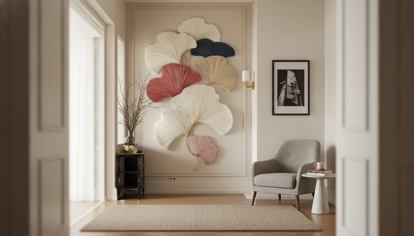
What usually falls flat is the “random accent” wall: a wall chosen only because it’s empty, not because it supports the furniture layout. Balance matters too; one strong wall often reads more elevated than multiple features competing for attention. To make it feel designed, repeat the statement color or material in two to three smaller elements—think pillows, a vase, curtain trim, or warm metal hardware.
| Approach | Best for | Difficulty | Budget feel | Common pitfalls |
|---|---|---|---|---|
| Paint (solid or color-block) | Fast transformation, rentals (with approval) | Easy | Low–Medium | Too-saturated color on all walls; wrong sheen for light |
| Wallpaper (peel-and-stick or paste) | Pattern and instant character | Medium | Medium | Misaligned seams; busy pattern in cluttered rooms |
| Board and batten / paneling | Architectural depth, classic styles | Medium–Hard | Medium–High | Inconsistent spacing; uneven baseboards |
| Tile or stone veneer | Kitchens, baths, fireplaces | Hard | High | Skipping waterproofing; heavy material on weak substrate |
| Wood slats / beams | Modern warmth, acoustic benefit | Medium | Medium–High | Uneven lines; poor finish near heat sources |
| Gallery wall / oversized art | Small spaces, flexible style changes | Easy–Medium | Low–High | Wrong scale; frames too high or too scattered |
Start with the room’s natural focal point: the bed’s headboard wall, a fireplace wall, the wall behind the sofa, or the dining wall behind the table. These placements look “meant to be” because the furniture already creates a visual anchor.
If you’re sampling paint, consider both mood and perception: color influences how energized or calm a space feels, and even small shifts in undertone can read very different across the day (see Colorcom’s overview on why color matters).
Put the statement behind the sofa or fireplace. Keep surrounding walls calm, then echo the accent in two to three textiles (a throw, one patterned pillow, and a rug stripe) so the wall doesn’t feel “separate” from the room.
The headboard wall is the easiest win. Darker hues or wallpaper can create depth and a cocooning effect that supports a sleep-friendly atmosphere—especially when the rest of the palette stays softer.
This is a great place to go bolder with pattern or a higher-sheen paint. If you choose gloss or high-gloss, commit to prep: it reflects light and can spotlight surface imperfections. For a quick sheen refresher, see Benjamin Moore’s paint sheen guide.
Prioritize moisture-safe materials and ventilation. Use tile where water hits, and opt for durable, washable paint elsewhere. If you’re sensitive to odors during painting, it’s worth understanding indoor air considerations like VOCs (see the EPA’s overview of VOCs and indoor air quality).
Choose the natural focal wall (bed wall, fireplace, sofa wall) or the first major sightline from the entry. Avoid walls chopped up by multiple doors and windows unless the feature is meant to frame them.
Yes—when it’s intentional. Keep the rest of the room simpler, repeat the accent in a few smaller elements, and choose a finish that suits the lighting so it reads as design, not leftover paint.
Paint (solid, arch, or color-block) and a curated gallery wall are the most beginner-friendly. Focus on prep, sample in different lighting, and use a level for crisp lines and balanced spacing.


Leave a comment