A cohesive home doesn’t require matching sets—it requires a clear plan that repeats the right elements (palette, materials, shapes, and mood) while letting each room serve its purpose. Use this room-by-room framework to connect spaces, avoid costly design detours, and make every room feel like it belongs to the same home.
Before shopping or rearranging, define a few “always true” rules that every room can borrow from. This creates unity (a core principle of design) while still leaving room for personality and function.
| Element | Choose Once (Whole Home) | Vary Room to Room |
|---|---|---|
| Color palette | Base neutral + 2 supporting colors | Accent color placement and intensity |
| Materials | 2–3 core materials | Textures (knit, boucle, rattan, stone) |
| Metals | Dominant finish | Secondary finish for contrast |
| Shapes | Primary shape language (curved or angular) | Statement silhouettes (one per room) |
| Lighting feel | Warmth level and style family | Fixture scale and number of sources |
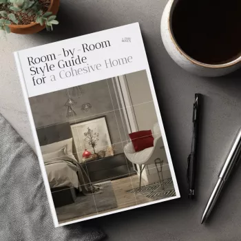
If you want a plug-and-play version of this process, the Room-by-Room Style Guide for a Cohesive Home – Interior Design Guide, eBook, and Digital Download keeps the key decisions in one place so updates stay consistent over time.
The entryway is the “handshake” of your home. It doesn’t need much—just a few intentional repeats of your blueprint.
The living room usually holds the largest pieces, so it sets the “design volume” for the rest of the home.
For inspiration references without locking into one “look,” browsing real-room examples can help clarify your preferred mix—Houzz is a useful visual library for comparing layout and style choices across different home types (Houzz: Home Design Ideas and Room Photos).
Kitchens have lots of built-in elements (cabinetry, counters, hardware), so cohesion here is more about restraint than decoration.
When choosing paint and undertones that won’t fight from room to room, it helps to compare colors in consistent lighting—Sherwin-Williams’ tools are a solid starting point for narrowing options (Sherwin-Williams: Color Inspiration).
Hallways are where sightlines collide. A few consistent rules make the entire home feel calmer and more intentional.
Homes with pets often need the same calm look with tougher, easier-care choices—Pet-Proof & Pretty: The Home Décor Checklist is a practical companion for selecting fabrics and finishes that stay polished day to day.
To keep your design decisions grounded in classic principles like rhythm, balance, and proportion, the Getty’s overview is a helpful refresher (Principles of Design).
If one room still feels “off,” a targeted change can do more than a full redo. For quick, high-impact fixes, Accent Wall Magic Checklist helps you create a focal point that looks intentional—and ties back to the palette you’ve already chosen.
A reliable formula is one base neutral, two supporting colors, and one accent used in small doses. Repeat those colors through textiles, artwork, and accessories so rooms feel related even when the layouts and functions differ.
Yes—mix styles by keeping the foundation consistent: shared palette, repeated materials/finishes, and similar shape language. Let statement pieces vary by room, but keep the “background” elements aligned.
Repeat one or two elements across sightlines—like the same wall color, a consistent metal finish, or the same frame finish in adjacent spaces. Styling hallways and transitions on purpose also makes the entire home read as one plan.


Leave a comment