A cohesive home aesthetic isn’t about copying the same look everywhere—it’s about making a few repeatable decisions and sticking to them. When your palette, materials, shapes, and “visual connectors” show up from room to room, the whole house feels intentional, calm, and finished (even if each space has its own personality). Use the steps below to set clear design rules before shopping, so new pieces naturally fit what you already have.
Start with outcomes, not objects. A room that looks great but fails daily life will never feel “right,” no matter how stylish it is.
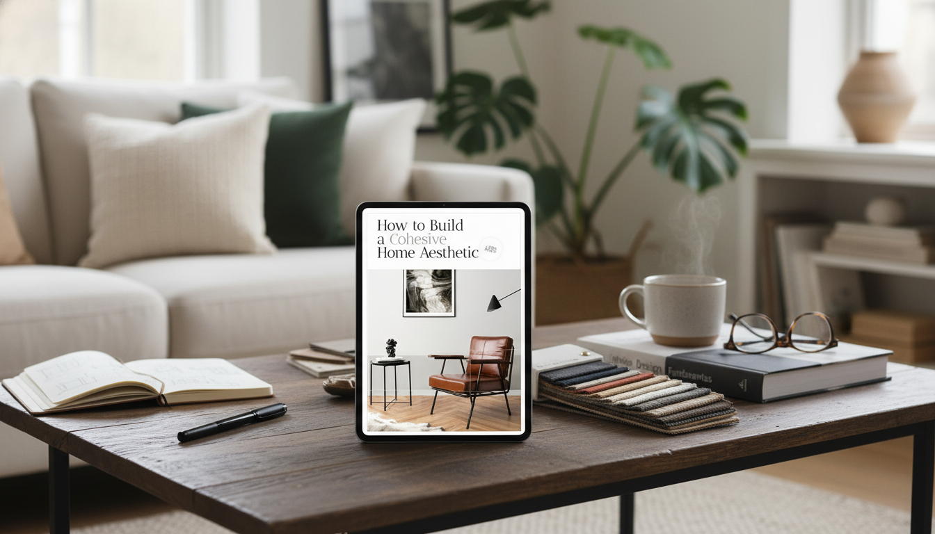
If you want a place to document these decisions before buying anything, the How to Build a Cohesive Home Aesthetic: A Step-by-Step Guide for Creating Your Dream Home keeps your room map, measurements, and rules in one organized plan.
A strong palette acts like a “background rhythm” that lets you change decor over time without starting over.
| Layer | What it covers | Good choices | How to repeat |
|---|---|---|---|
| Base neutral | Walls, rugs, large upholstery | Warm white, greige, soft beige | Keep consistent across main areas |
| Secondary neutral | Case goods, curtains, bedding | Taupe, charcoal, oatmeal | Use in 2–3 rooms |
| Wood/metal direction | Tables, frames, hardware | Light oak + brushed brass (example) | Stick to 1–2 finishes |
| Accent color | Decor + small furniture | Sage, terracotta, navy (example) | Echo in art and textiles |
For tighter color communication (especially when mixing textiles and paint), reference standardized systems like Pantone Color Systems and Guides.
If color is the melody, materials are the texture—and they’re often what makes a home feel coherent at a glance.
Shape is an underrated “glue.” When silhouettes repeat—rounded, angular, or a classic mix—rooms feel related even if the decor changes.
Your home is experienced in motion—especially through doorways, halls, and open sightlines.
Need visual references while you plan? Browsing curated room photos can help clarify what you’re repeating—Houzz: Interior Design Ideas is useful for quickly comparing palettes and finishes across room types.
If you’re adding a focal point like a painted feature wall, a checklist keeps it aligned with your palette and finish rules. The Accent Wall Magic Checklist helps you choose placement, color, and balance so it looks bold—but still “belongs” in the home.
For a practical, room-by-room approach to durability (without sacrificing style), use Pet-Proof & Pretty: The Home Décor Checklist to plan washable textiles, smarter storage, and high-traffic styling that still looks cohesive.
Repetition is the secret: reuse a consistent palette, a limited set of finishes, and a clear shape preference across rooms. Add connectors (like matching frame finishes or repeated textiles) and keep lighting temperature consistent, then let each room have one distinctive element for personality.
A reliable starting point is 2–3 neutrals plus 1–2 accent colors. Repeat the accents in multiple rooms and pay attention to undertones, testing samples in real lighting before committing.
Focus on high-impact basics: paint, consistent light bulbs, textiles, and matching frames or hardware. Thrift with a clear finish plan, buy fewer larger pieces that anchor a room, and skip small random decor that doesn’t repeat your palette or materials.


Leave a comment