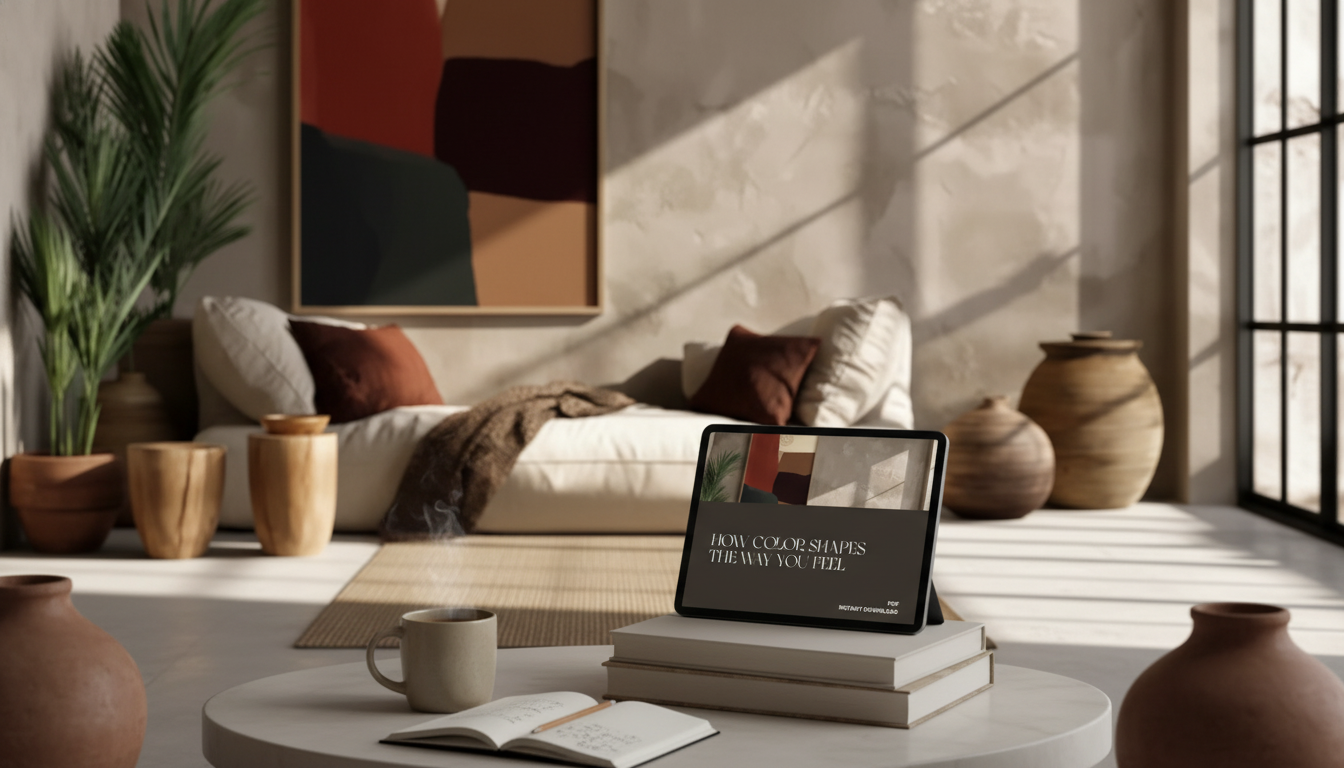
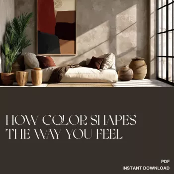
Color influences mood, energy, focus, and comfort—often faster than words. With a few intentional choices, a room can feel calmer, brighter, cozier, or more motivating without changing the layout or buying all new furniture. This guide breaks down how common colors tend to affect emotion, how lighting and undertones change the result, and how to build simple palettes for home décor, daily routines, and creative work.
Your brain processes color at high speed, so it can shift a room’s “read” before you notice details like styling or furniture lines. A cool hue can make a space feel more open and airy, while a warm hue can pull surfaces forward and feel more intimate.
That reaction isn’t only biology—it’s also association. Personal memories, cultural meanings, and context can amplify or soften the typical effects of a color. A sunny yellow might feel optimistic to one person and distracting to another if it reminds them of harsh lighting.
Intensity matters as much as hue. A soft, gray-leaning version of a color often feels calmer than a highly saturated version of the same shade. And most real-life “mood” comes from combinations, not one color everywhere. A balanced palette (plus texture and light) is usually what makes a room feel right.
Color psychology isn’t a rigid rulebook, but these patterns show up often in home environments and workspaces:
| Color family | Typical mood effect | Best in | Try as |
|---|---|---|---|
| Soft blue | Calm, steady, clear | Bedroom, study, bathroom | Wall color or bedding |
| Sage/olive green | Restorative, balanced | Living room, entry, kitchen | Walls, cabinets, textiles |
| Warm white/beige | Comforting, open | Anywhere | Base wall + trim pairing |
| Terracotta/rust | Cozy, grounded | Dining area, reading nook | Accent wall, pottery, throws |
| Mustard/yellow | Cheerful, alert | Breakfast corner, office | Art, chair, small décor |
| Deep navy/charcoal | Focused, dramatic | Office, media room | Accent wall, built-ins |
If a paint chip looked perfect in the store and “wrong” at home, lighting and undertones are usually the reason.
When uncertain, choose the calmer version of a favorite color (slightly grayer or less saturated). It’s easier to add energy with accents than to subtract it after a full repaint.
A practical way to design with color is to pick the emotion first, then build the palette with a dependable ratio.
For design and readability standards (especially if you’re setting up a digital workspace), contrast guidance like the W3C WCAG recommendations can be surprisingly helpful.
For broader research and context on how color can affect psychological functioning, the American Psychological Association is a reliable starting point. If you enjoy exploring color directions and palette ideas, Pantone’s color insights can help you spot combinations that feel current without forcing a trend into every room.
Softened blues, blue-greens, sage, and warm neutrals are reliable choices for a calmer feel. Keep saturation low, test the color in your lighting, and aim for a low-contrast palette so the room reads restful rather than busy.
Natural light direction, bulb temperature, reflective surfaces, paint undertones, and sheen can all shift how a color appears. Sample swatches on multiple walls and view them at different times of day before committing.
Use one bold accent color in a controlled area (like a pinboard or desk zone) and keep the main background quieter. Repeat that accent in a few small touches and balance it with calming textures to avoid overstimulation.

Leave a comment